Infogram Exercise
Whilst using Google Drive you can create some effective visualisations, it doesn’t offer a large selection of options when it comes to the appearance of your chart/graph. To create data visualisations with a bit more visual appeal we’re going to use Infogram
- Open Infogram and login. To start a data visualisation, click on the ‘Create’ button
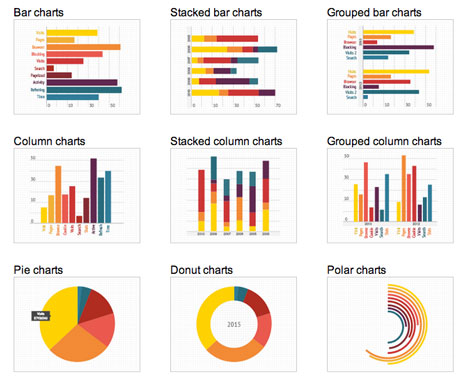
- Select a template for your visualisation – click on the ‘Charts’ tab at the top of the page, select the ‘Pie’ chart and click on the ‘Add Chart’ button.
- Add the title BBC Spending – TV to your chart.
- Click on the BBC data button (under the image on the right) and copy all the data in the ‘TV’ tab.
- Go back to Infogram, double click on the pie chart and in the spreadsheet that appears delete all the current information and paste in your copied data.
- To style your visualisation, above the spreadsheet you have some options – select between ‘Pie’ and ‘Donut’ to change the shape of your chart. Click on the ‘Colors and Settings’ link to change the colours used and height of your chart. Click on the ‘Done’ button when you’ve finished.
- Delete the ‘Description’ field
- In the right hand menu, click on the ‘Add Text’ button. In the pop-up window that appears select ‘Chart Title’ and enter the title BBC Spending – Radio in the new text field that appears.
- In the right hand menu, click on the ‘Add Chart’ button. In the pop-up window that appears select ‘Pie’ and click on the ‘Add Chart’ button.
- Open the data again and copy all the data in the ‘Radio’ tab
- Repeat Steps 5&6 for this new chart.
- When you’re finished with your visualisation, click on the ‘Eye’ button at the top of the page to preview it. To embed your chart on The Breaker click on the ‘Share’ button in the top right hand corner, make sure you work is titled and has a description and click the ‘Publish’ button. Copy the embed code and paste it into the ‘Text Editor’ of the post on The Breaker where you want it to appear.


