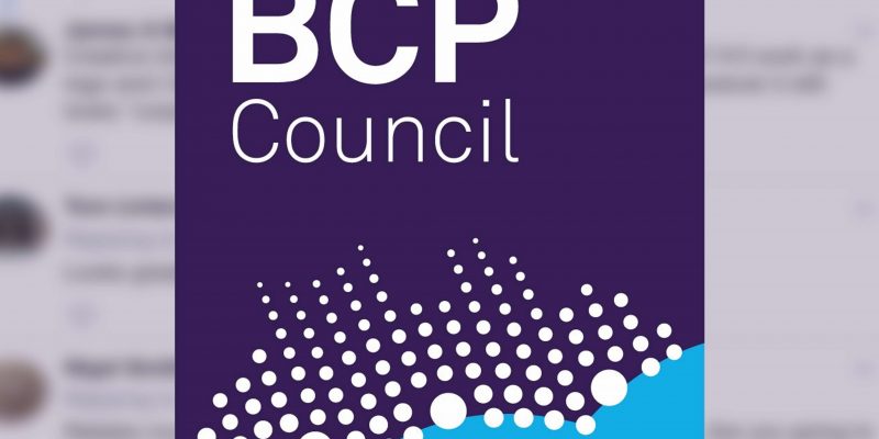
A new £8,000 logo for Bournemouth, Poole and Christchurch councils (BCP) has been revealed – but what do you think of it?
The BCP shadow authority has announced that they are “pleased” with the new logo ahead of the merger due in April. It has also pushed a campaign #spotyourdot to promote the launch of the logo.
We are pleased to reveal the launch logo for #BCPCouncil. Where do you live in #BCP? Can you #spotyourdot? pic.twitter.com/Pdh6qtTzYC
— BCP Shadow Authority (@BCP_SA) January 8, 2019
Many locals from Bournemouth, Christchurch and Poole have shared both their congratulations and criticisms of the new logo.
You should have held a borough(s) wide competition, we have so many creative and talented people within the three towns, it could have really engaged with the community
— Rebecca Smith (@Rebecca_S_Smith) January 10, 2019
Looks like a Car Park Security Company logo – says nothing about the area and what we value #Fail
— Bill Mason (@BoMoBill) January 10, 2019
The proposed logo is a step in the right direction! However the small dots should be a shade of yellow to reflect the new authorities major asset, the beaches and coastline rather than 'snowstorm' white. Think of Torbay 'the English Rivera' and Brisbane's 'Gold Coast'!
— Nigel Brooks (@brooksnigel) January 10, 2019
The 113 dots shown in the new logo is said to represent the 76 councillors, 33 wards, three towns and one council. It was released in response to a survey in November 2018 of four other proposed designs.
Other members of the public have criticised the design like the colour scheme, or some dots inaccurately representing the geographical landscape of the Bournemouth, Christchurch, Poole area.
This new logo will now be used as the new face of the merger council which is due on April 2019.
The logo has also brought in comparison to the Dorset merger logo (which replaces the originally separate councils of North, East and West Dorset. As well as Purbeck, Portland and county councils.)
The logo, featured below was designed by in-house designers and cost nothing.
We asked Bournemouth residents what they thought about the two logos and if they could guess which one cost £8,000.


 Dorset Darting sensation Scott Mitchell on his hunt for World Championship Glory